WORLD OF TANKS CONSOLE - GARAGE REDESIGN
MISSION
Redesign “the Garage” to and reduce Redundancy with the Game Modes Menu system and create a ONE STOP SHOP.
TOOLS USED
Photoshop, Illustrator
Flowcharts
GAME OVERVIEW
“World of Tanks” is an online multiplayer military vehicle combat game made by Wargaming.net.
The game is filled with different nations and loads of tanks players can research and choose to purchase and is played all over the world and is on multiple platforms.
As a QA Tester for Wargaming Chicago in 2016, and as a New User to the franchise - World of Tanks was overwhelming, and I was frustrated with it’s Garage Interface.
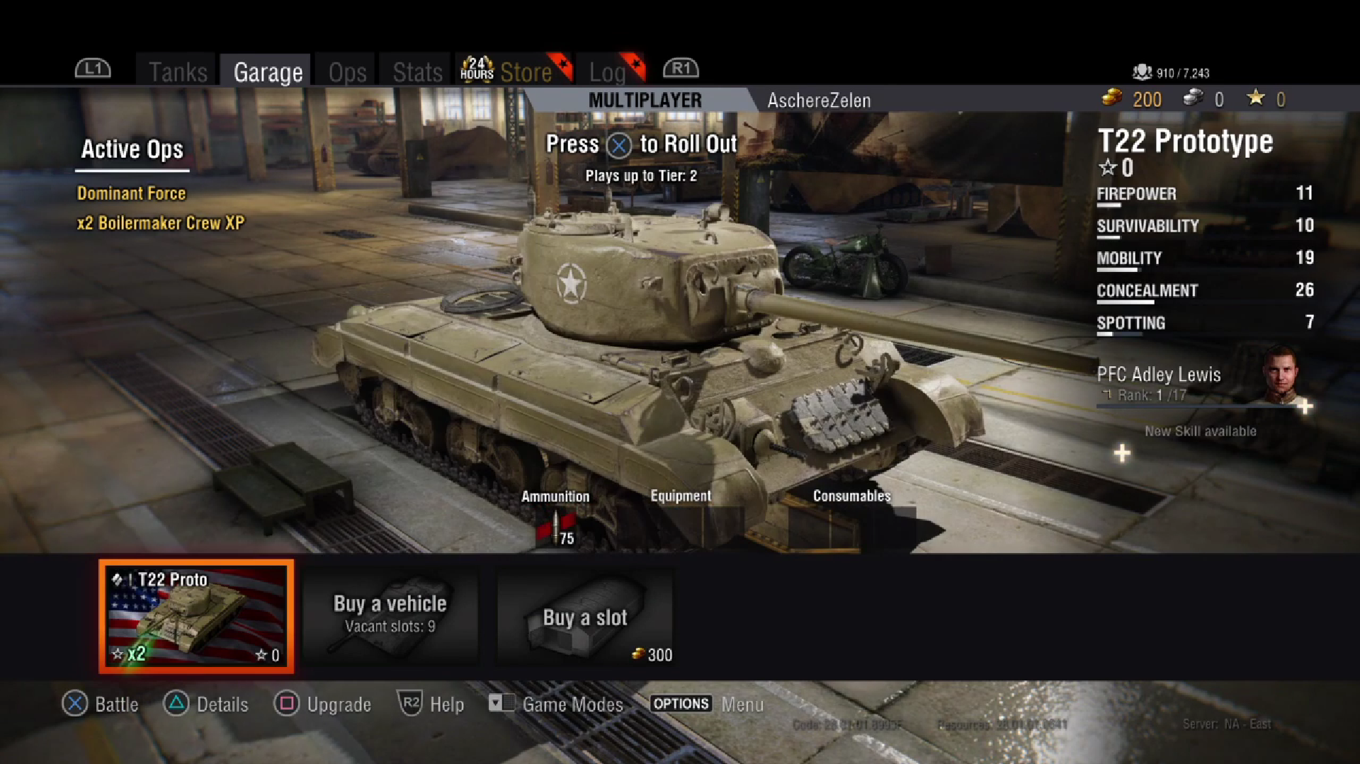
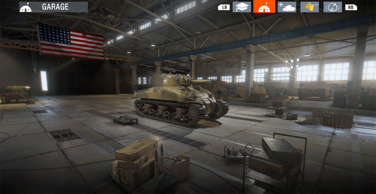
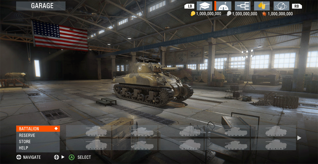
THE GARAGE
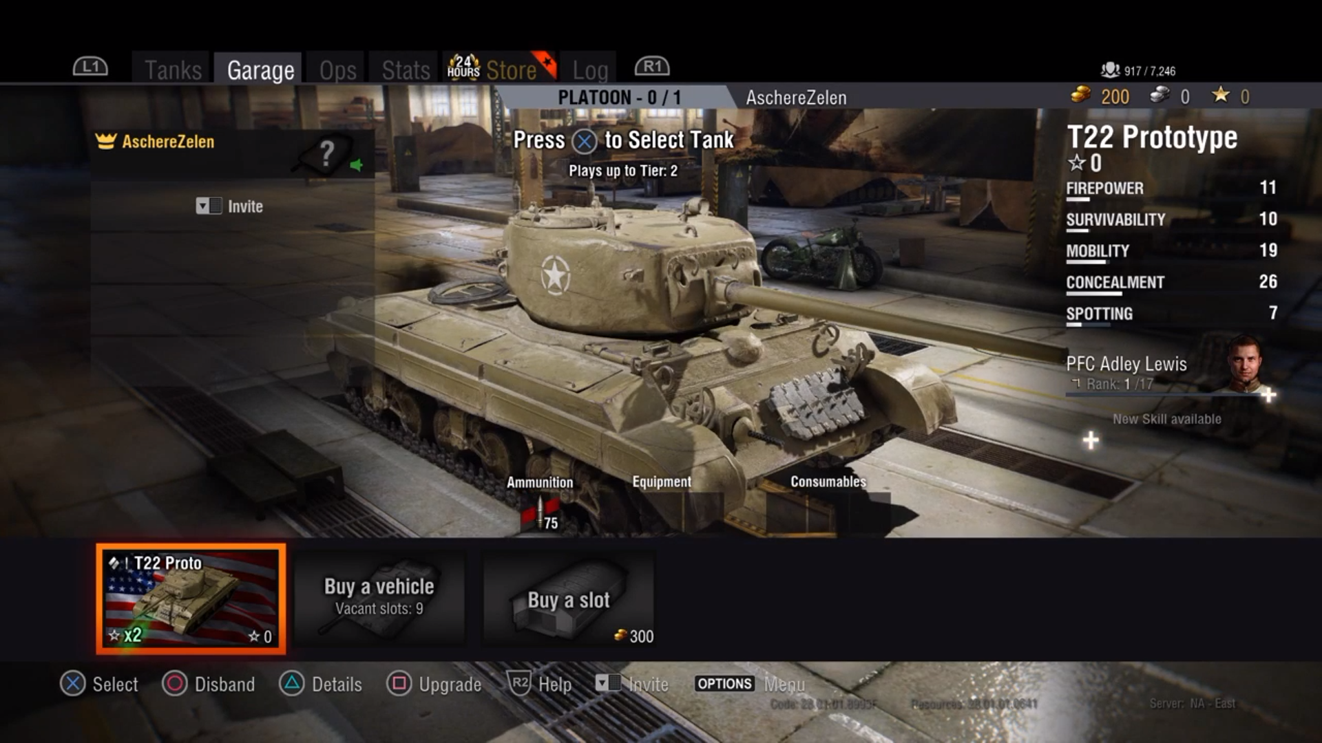
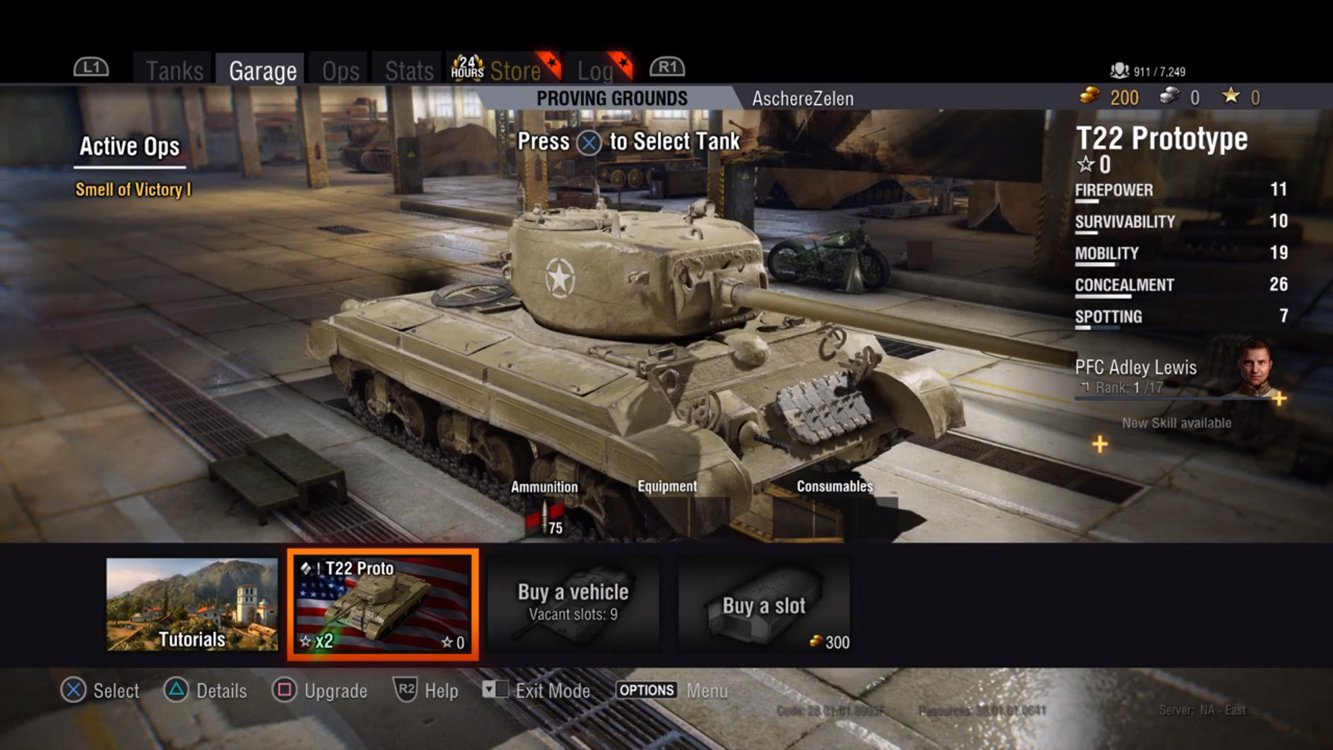
By Default, Users no matter the Game Mode are brought to The Garage, as this is where our users spend a majority their time between matches.
Here, users are able to do a variety of military tank technician stuff such as modify, repair, or purchase tanks and their parts, modifying crew, and balancing their budgets.
THE REDUNDANCY OF THE GAME MODES MENU
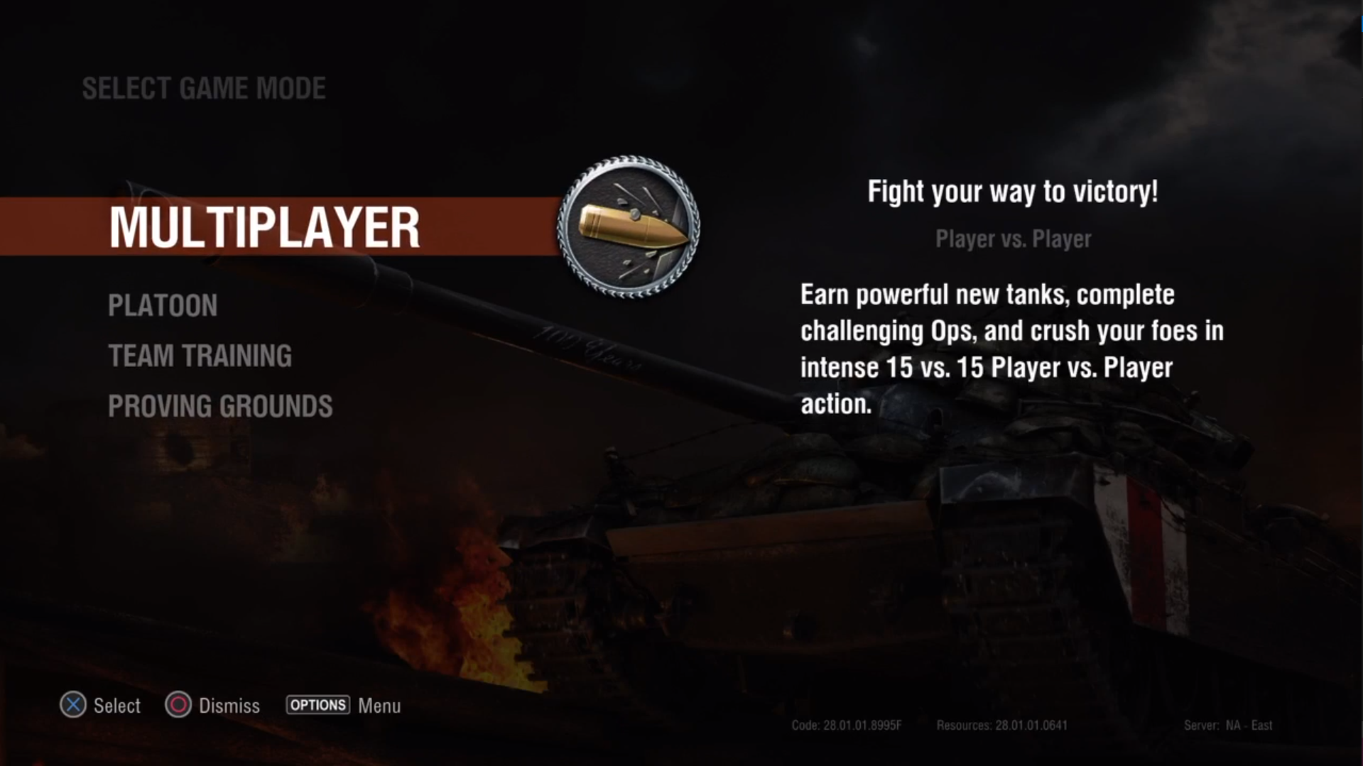
This video is of the New User Experience of World of Tanks Console at the time in 2016, which displays the redundancy of the Game Modes Menu.
Multiplayer - Battling others
Platoon - Create or Join a Party up to 3 players before Match Making in Multiplayer
Team Training - Custom Games Browser
Proving Grounds - First Time User content.
All of which lead the player to a nearly identical Garage.
Causing what I referred to at the time as, “Navigation Disorientation”.
Without enough distinction, I felt the new players would get disoriented, and waste more time than needed during the onboarding experience.
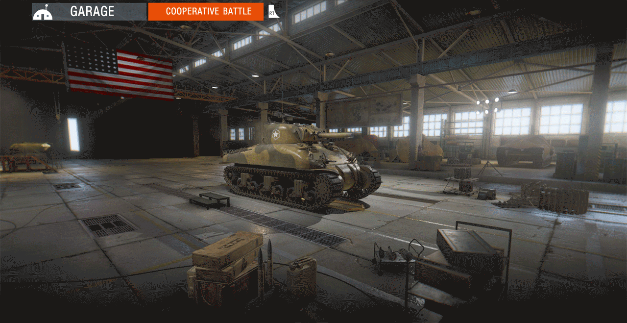
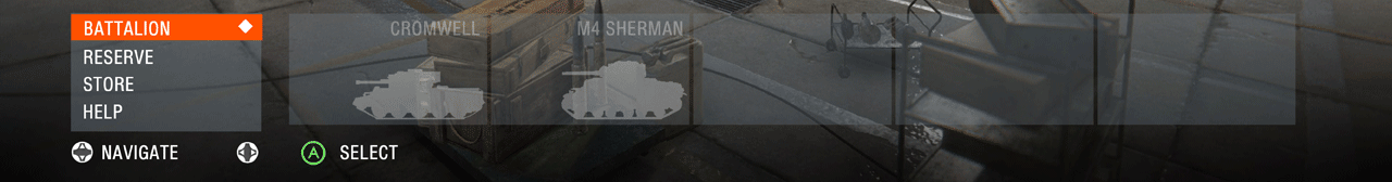
Can you spot the differences in the screenshots below?
MODE USER FLOWS AND THEIR PURPOSES
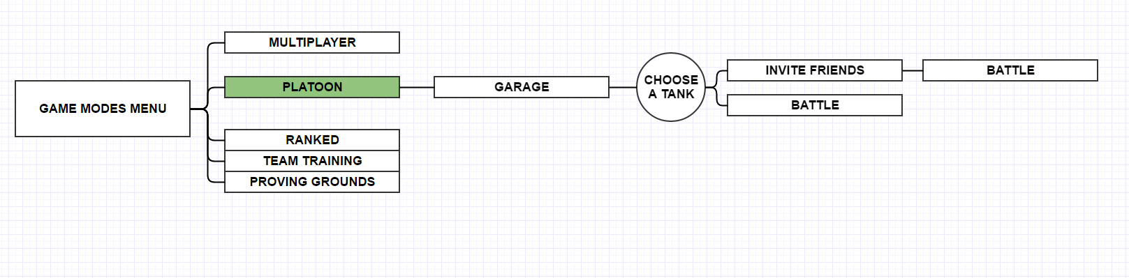
Multiplayer and Platoon
Multiplayer, and Platoon are the Player vs Player (PvP) Matchmade Battles. All proceeding to same Matchmaking Queue, where players Battle other players. (Ignore Ranked in the Diagrams below, incorrect label). Platoon is Multiplayer with the exception function to create a Squad before entering Battle. Separating Individual players and Squad is fine for matching during match making, but it shouldn’t be an entire menu screen the user has to load in and out of. There are cleaner solutions.
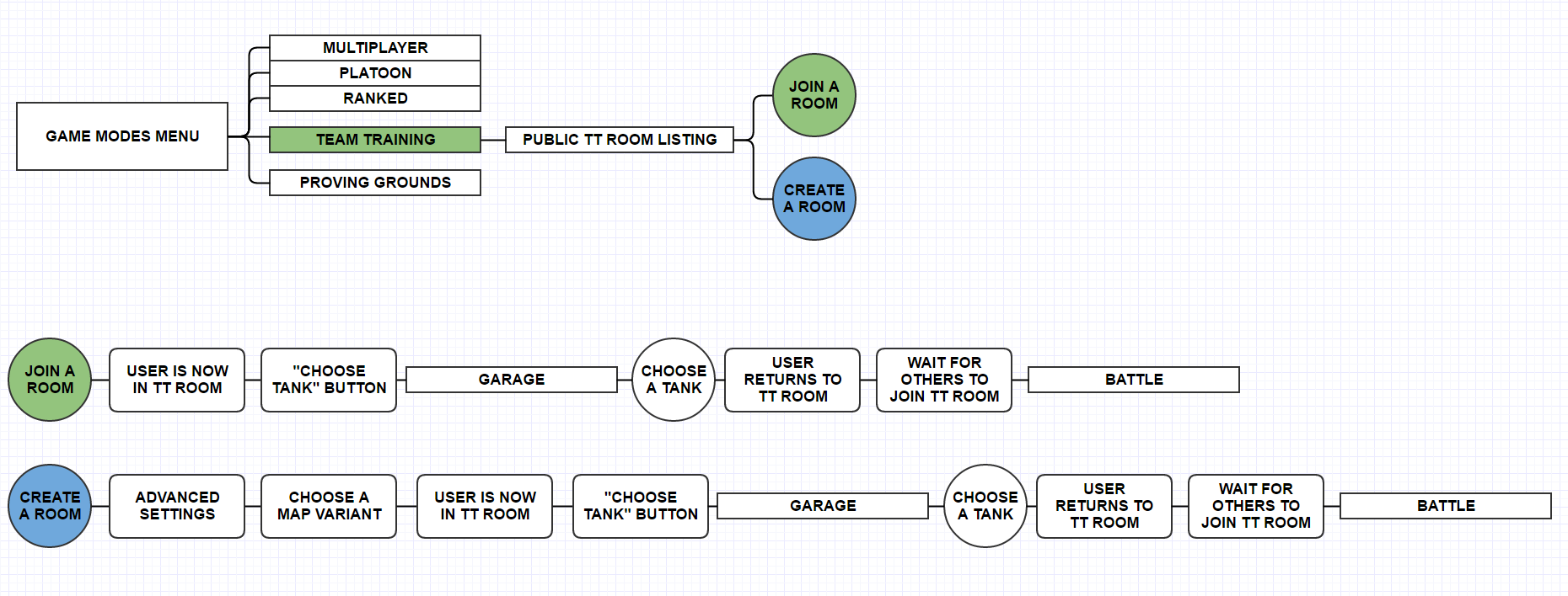
Team Training
Team Training is a Public or Private Room created by Premium users for use by both Premium and Non Premium users. It creates a Custom Lobby where 30 users can Battle.
Between Platoons and Team Training, I figured there might be a better way to invite players to a Lobby for both Platoons and Team Training, without needing to leave the Garage as any player.
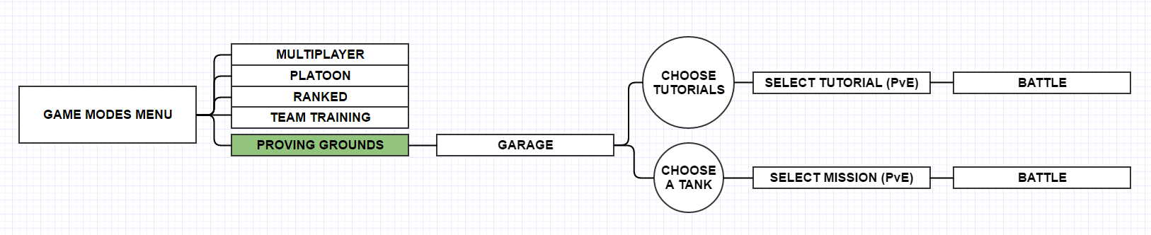
PVE Game Modes
Proving Grounds is our Player vs Environment (PvE) content. Tutorials and other single player focused exercises can be accessed.
Unique dilemmas for accessing Proving Grounds are the result of Training or Tutorials being hidden within the vehicle reel.
The Tutorials Slide directs the user to a listing of interactive and non interactive tutorials and videos.
If the user selects any of their vehicles within the Proving Grounds vehicle reel, they are directed to a listing of various PvE content.
This could be solved by making a specific Tab dedicated to Training, Tutorials, and helpful guides.
THE PROBLEMS ARE IDENTIFIED, LETS HEAD BACK TO THE GARAGE
The Garage
(A) Content Tabs - All Tabs contain content for various aspects of the games ecosystem: You have a tab for: Tanks, Garage, Ops, Stats, Store, Log.
(B) This area displays the Current Game Mode and a prompt to Rollout! or begin matchmaking.
(C) Player Information - Displays the username, Currencies, and players online at the time.
(D) "At a Glance" - Displays what Ammo, Equipment, Consumables are equipped to the select Tank.
(E) Vehicle Reel - Displays all vehicles owned by the user. Users can use a pop up filter to quickly organize or find specific tanks.
These Forms are essential to users, but we need some new ones to break out of the Game Modes Menu and Condense it into this Garage.
REDESIGNED USER FLOW
Goal:
Keep the player in one place
Feature Overview:
Content Header / Tabs
The Deck
The Slide-Bar
The Vehicle Reel
Battle Type Cycler
Below I detail the new designs
REDESIGN FORM OVERVIEWS


Location Header
Content Tabs
Player information (Currency, Rank etc not seen)
New Content Tabs
Training - A whole Tab dedicated to Training Users, this is where Proving Grounds would move to.
Garage - Default Tab
Tanks - the Tank Tree where users purchase their tanks and have access to the Store
Player Profile - All things player driven, new home for Stats, Log, and other various things like Active Ops.
Feed - this section is for Community updates so the users can stay up to date on Patch Notes, and other various Developer communications.
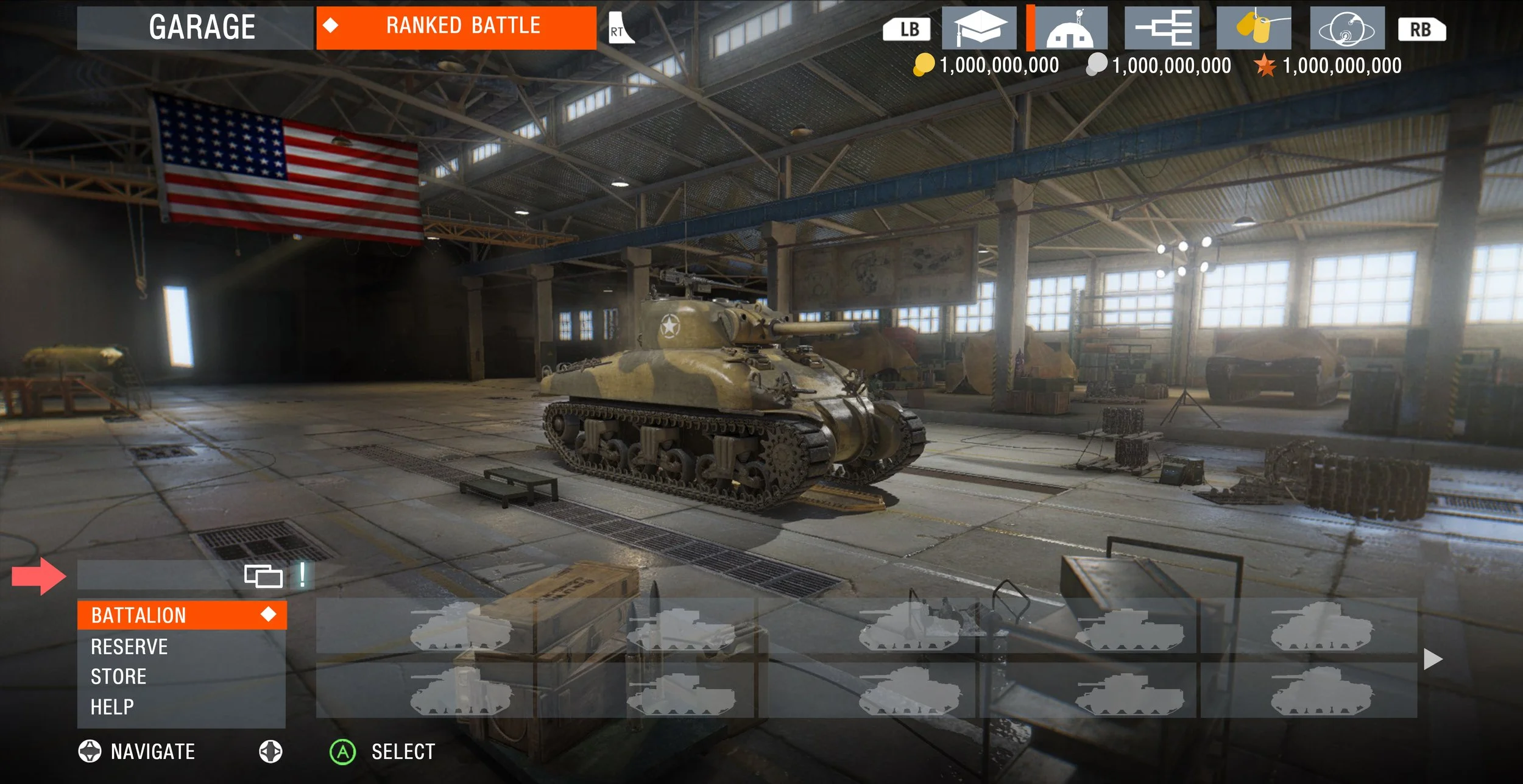
Battle Type Cycler
Instead of Switching Modes via a massive menu, we can scale it down and make it a drop down. This mockup is ugly but the potential for it is great if we want to expand to different modes.
Slide-Bar
I saw an opportunity to utilize the far left side of the Vehicle Reel to provide a Sub-Menu to condense content into their own Reels, or even their own unique menus should we want to differentiate them.
Battalion - Displays all Tanks owned by the user
Reserve - to Manage things such as Ammo, Crews, Equipment and Consumables which are not attached to any Tank / Tank Crew
Store - for direct access to the Store, having it there is nice, still accessible from other tabs to keep the player purchasing, showing with different contexts.
Help - For users who need help understanding the interface or anything else, they can go here!
Users Select a Slide-Bar Category using the left analog stick + A
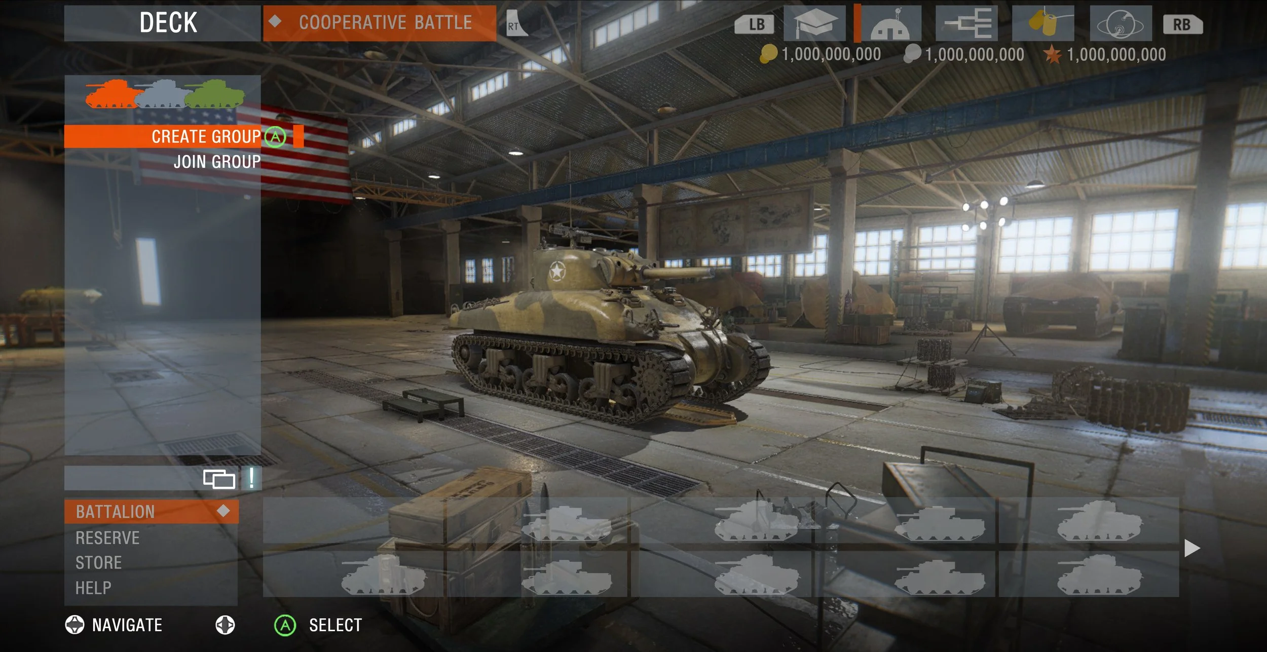
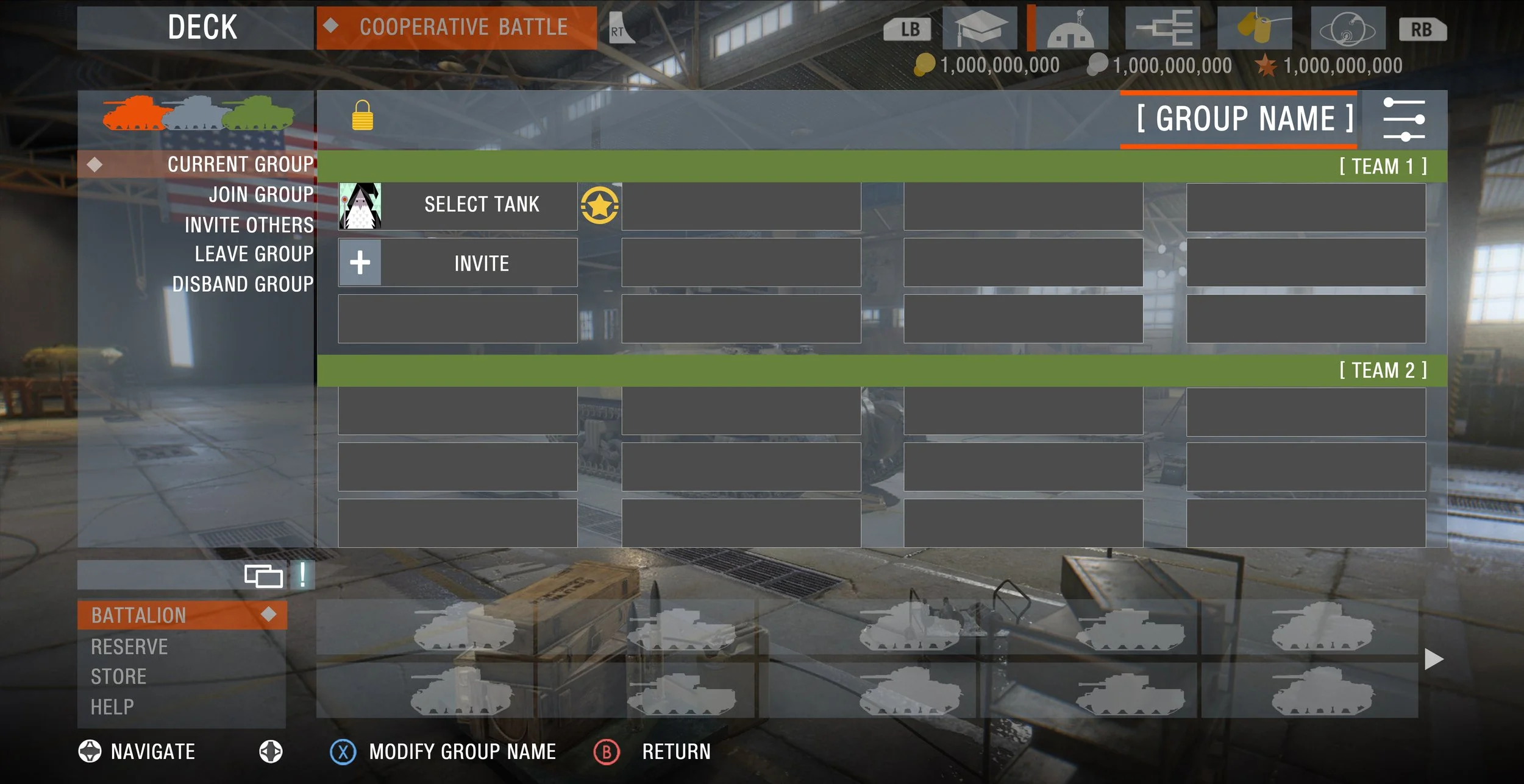
THE DECK - PLATOON OR CUSTOM GAME MENU
To solve for the Platoon / Team Training issues, I wanted there to be a nice integration of a Multiplayer Lobby within the Garage without needing to take the player out of the Garage. Below we see the Deck
What I learned and What I could have done better
The designs are anything but perfect, but I'm proud of them! It helped me grow and not be stuck in the weeds in my own designs and take into account other user needs. Best part about it was being able to meet UI/UX people at the studio, which helped me gain more of an understanding of the UI/UX process.
Action Items I wish I had fixed or had done:
Make a clear Battle Button. I had the “Battle Type Cycler” as a Battle Button, but it wasn’t very clear it was going to take you to Battle. It was a means to replace the Game Modes Menu. I think I could have utilized the Head Location Space as the Cycler area, and then the Cycler area as the Battle Button.
The Content Tab could be cleaned up, and the Text for each Content Tab, should be displayed near it, not on the other side of the interface.